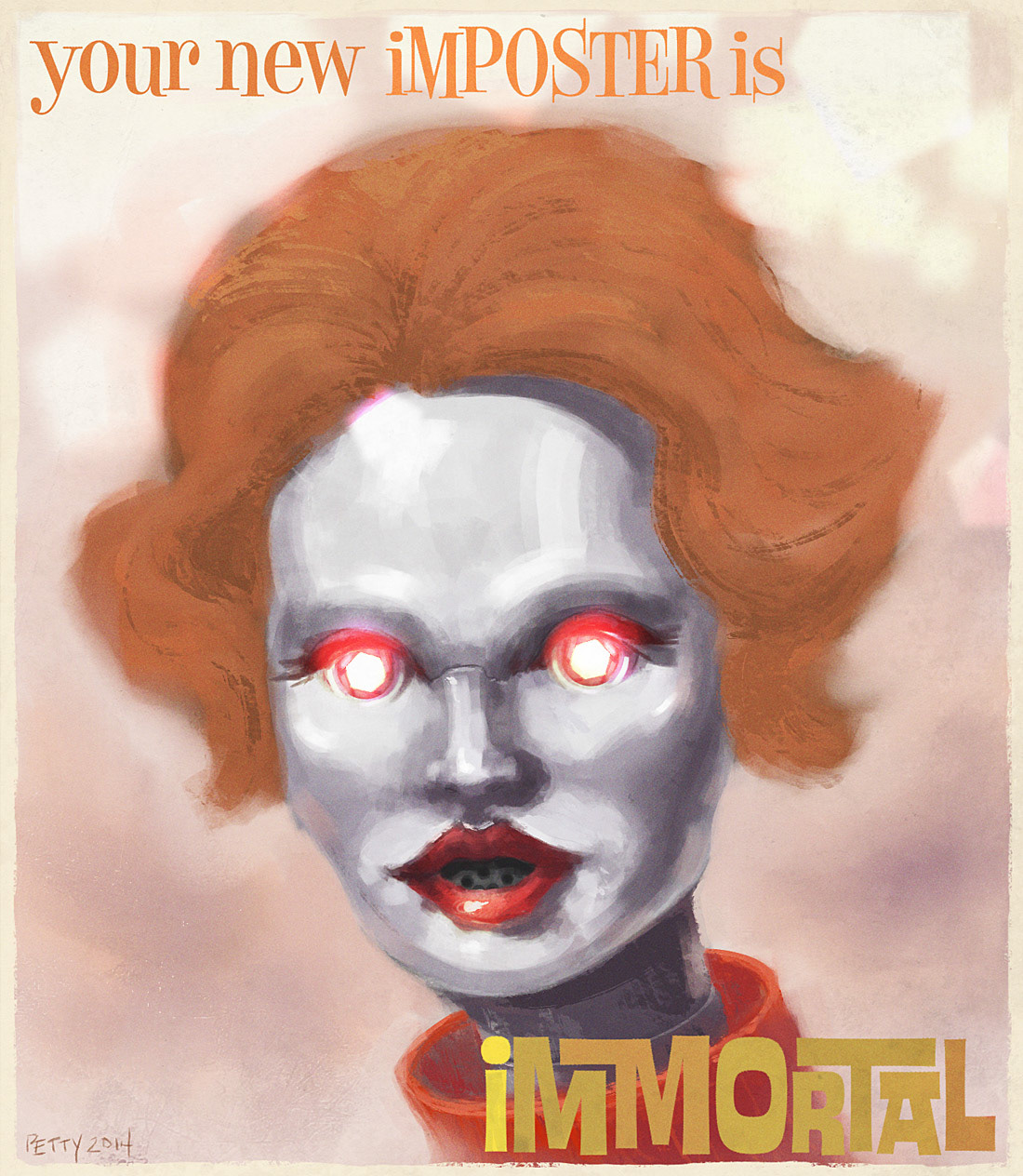
I painted this key art image; Logo design by Cory Schmitz.
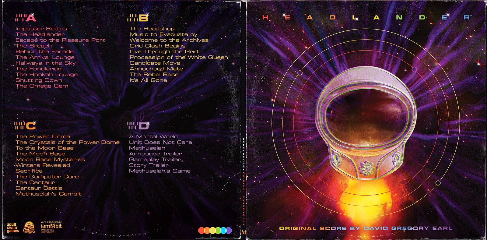
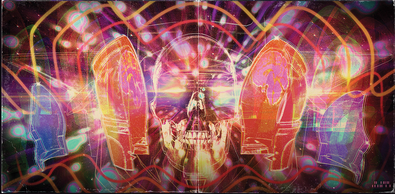
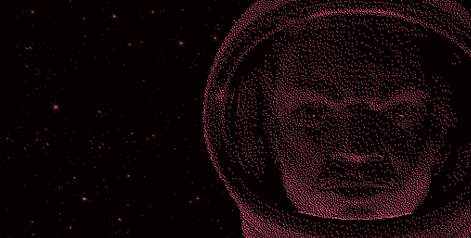
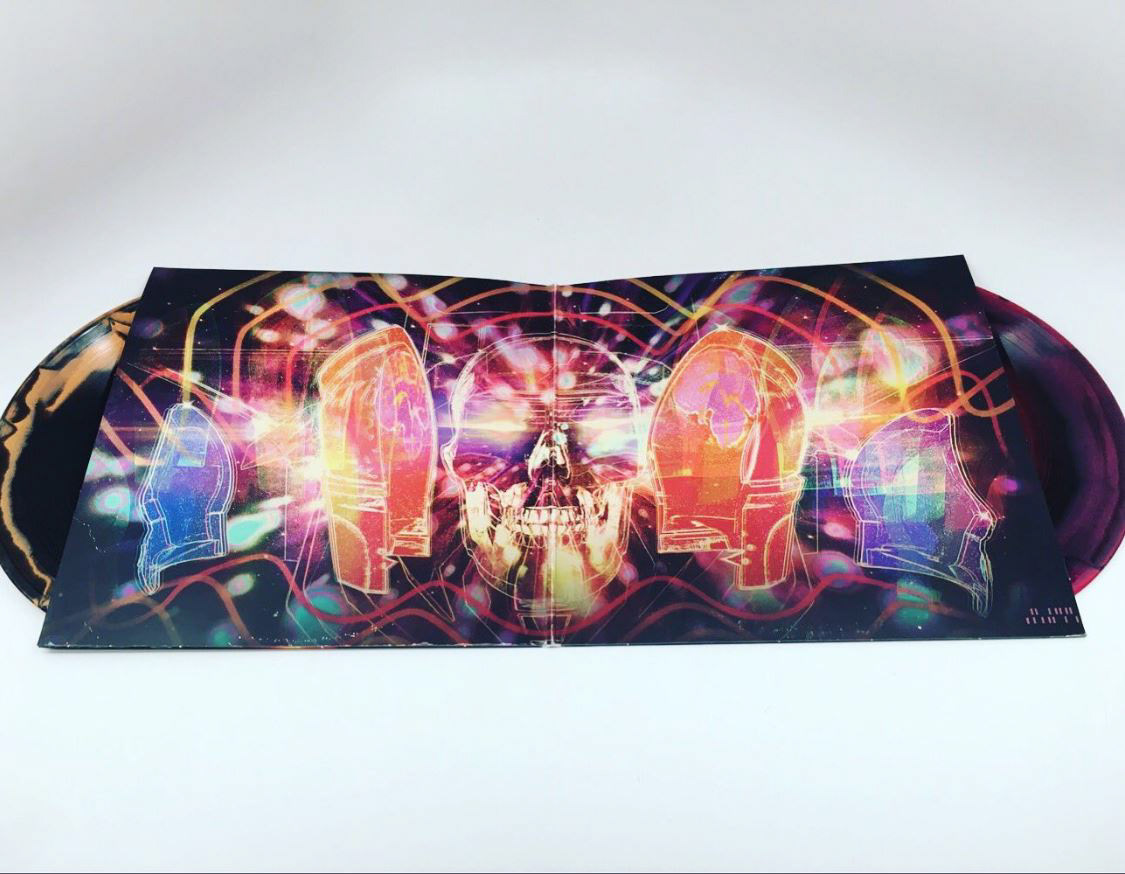
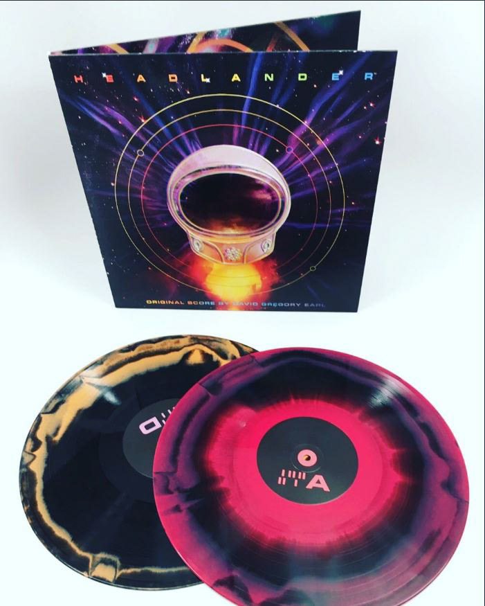
I created the following four images for the double vinyl edition of the soundtrack.

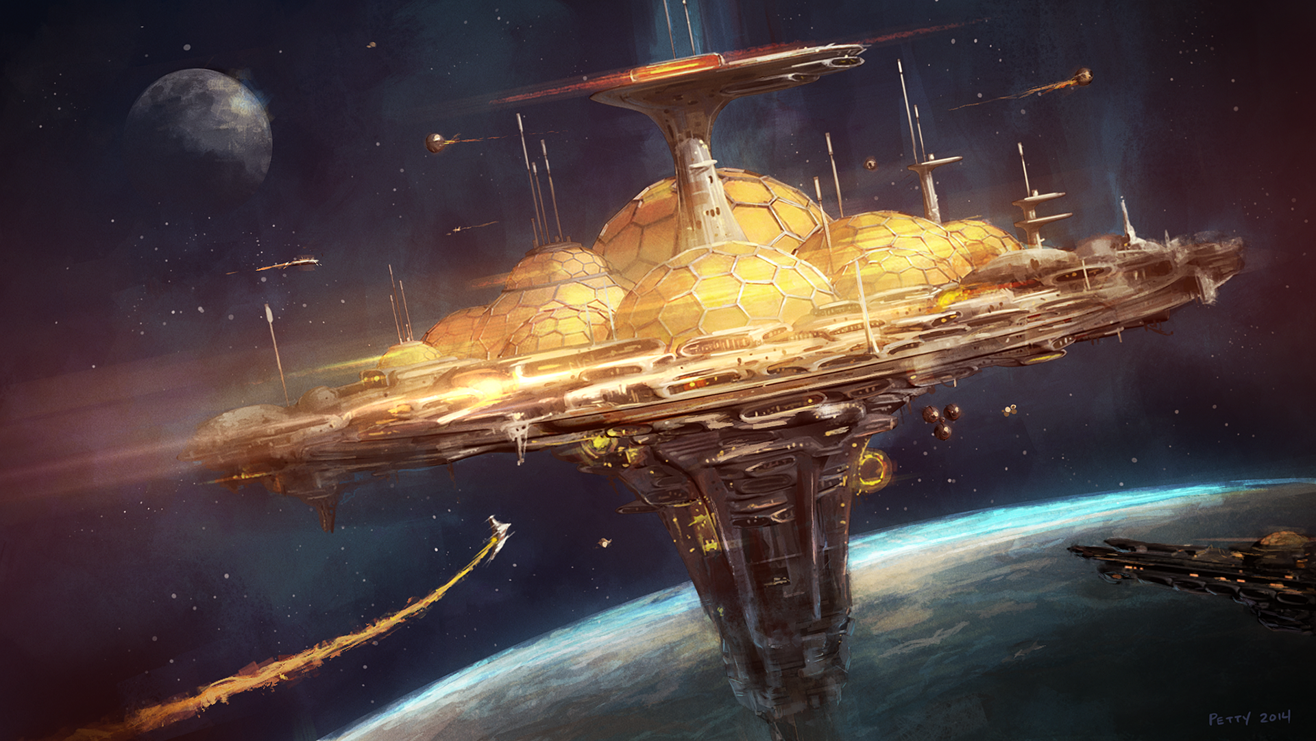
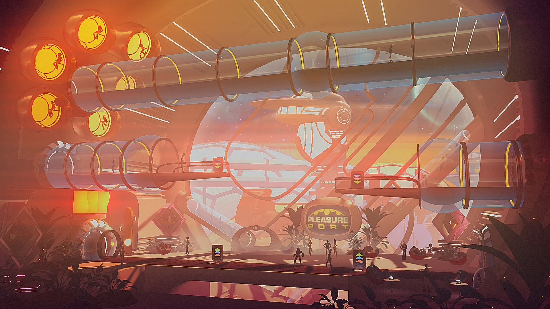
I created this early concept of the Pleasure Port, the first space station in the game.

This image was created as our visual target, early in development. It helped drive the development of our lighting and post-processing system.
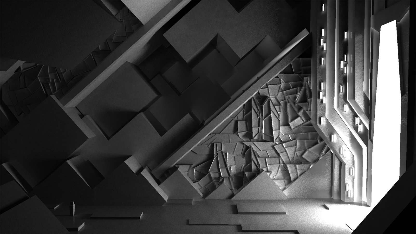
Early visual development for Luna Citadel, the Moon Base in the second half of the game. This shapes were inspired by Brutalist architecture.
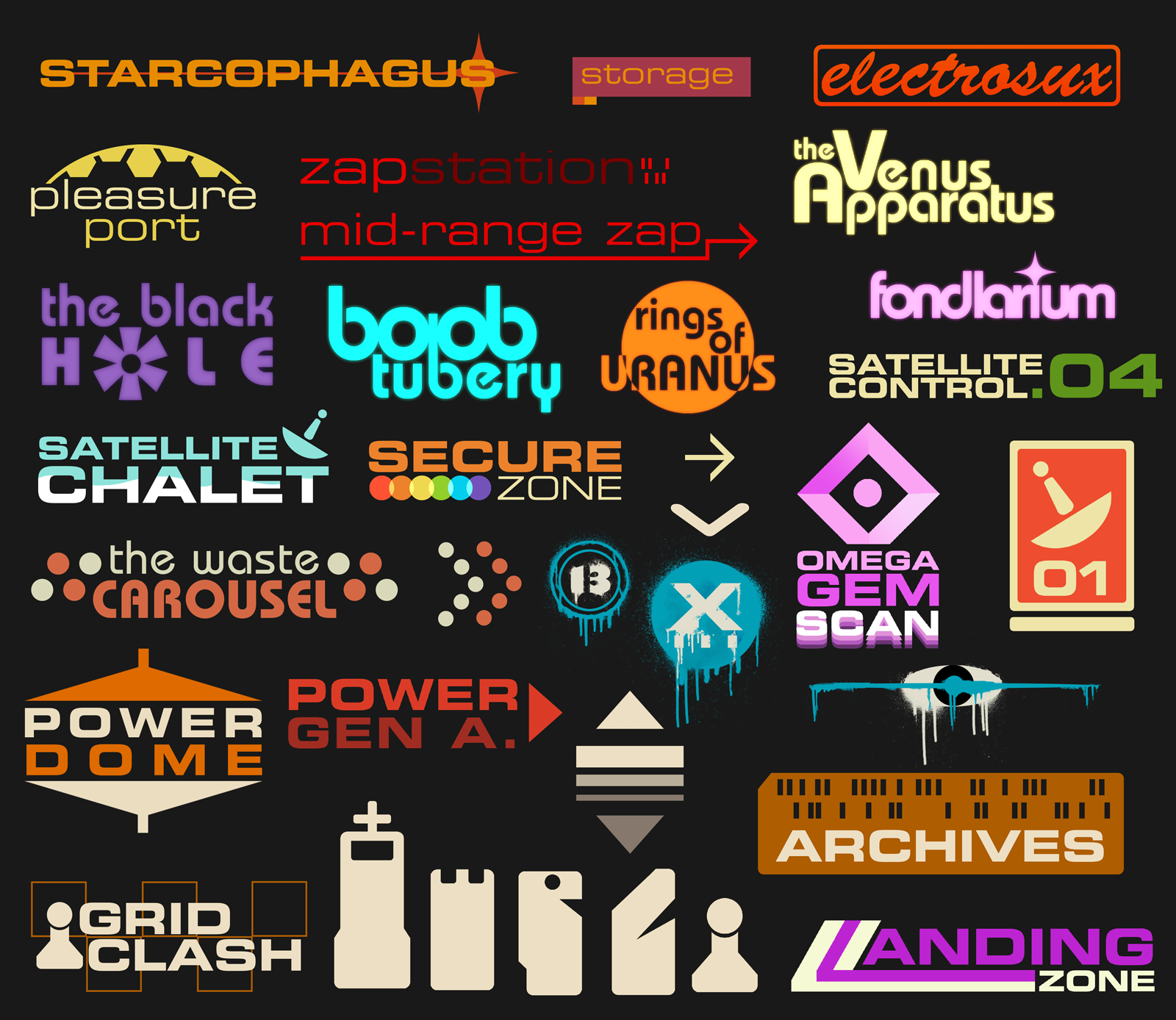
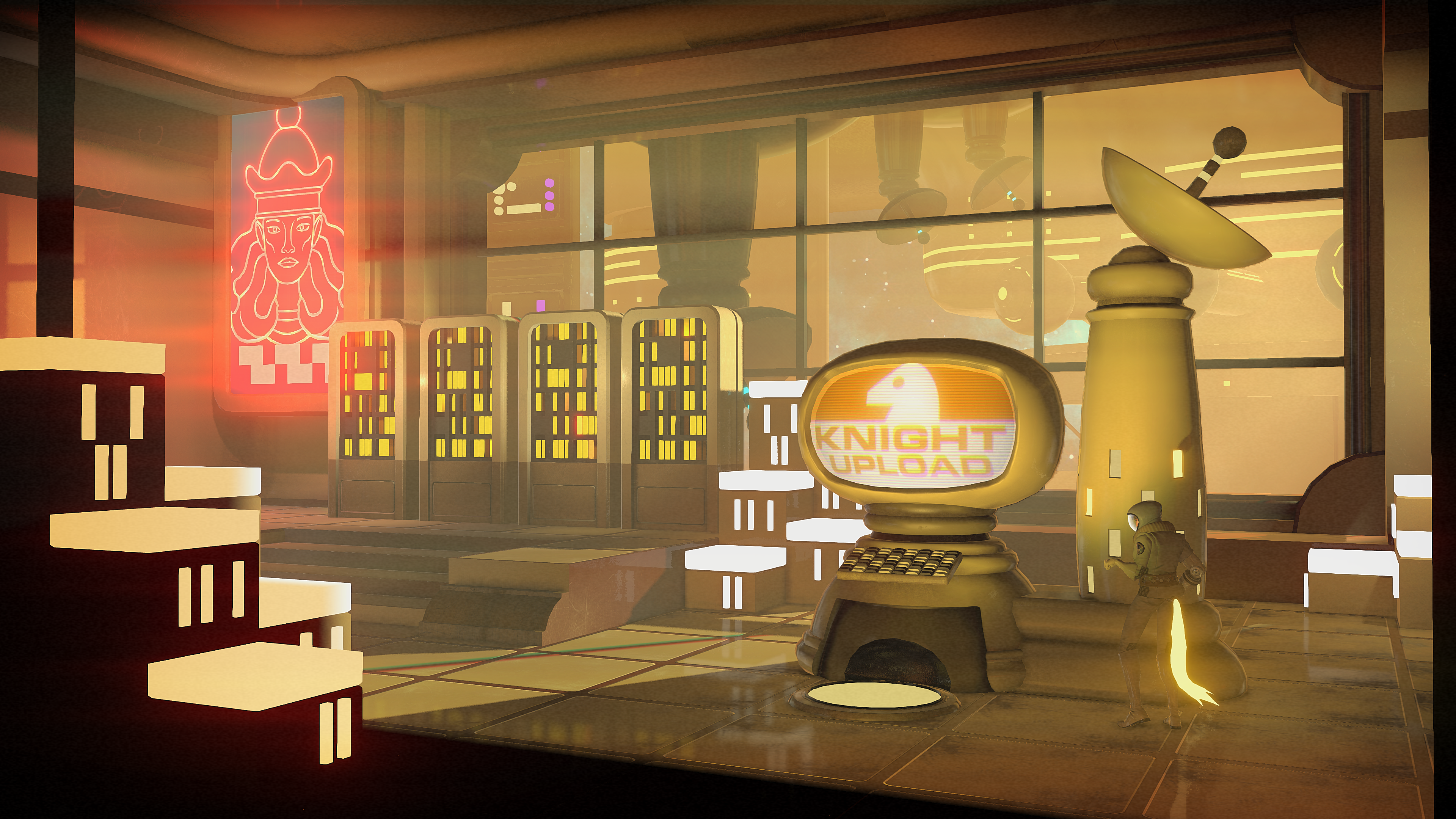
I created many in-game signs and logos. Here are a few examples.
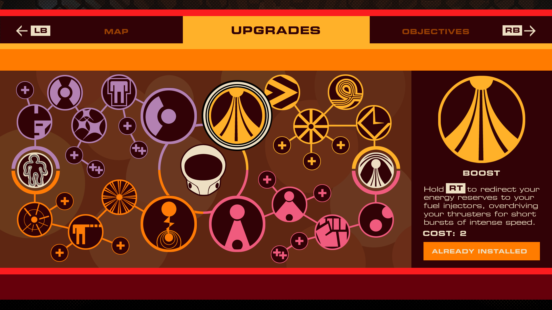
I was responsible for the design and creation of the HUD, Pause Menu, and Front End. The Upgrades screen is show above.
I animated the Headlander logo. Logo design by Cory Schmitz.


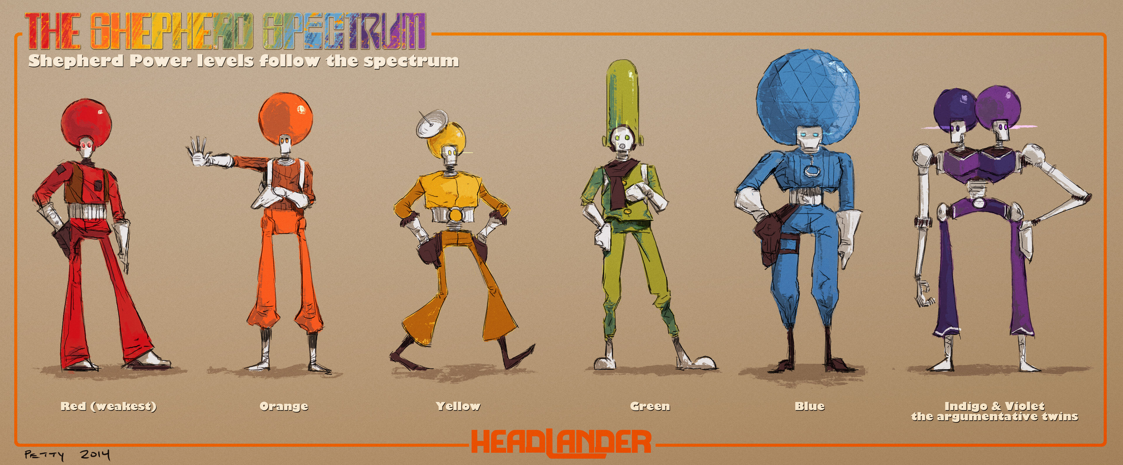
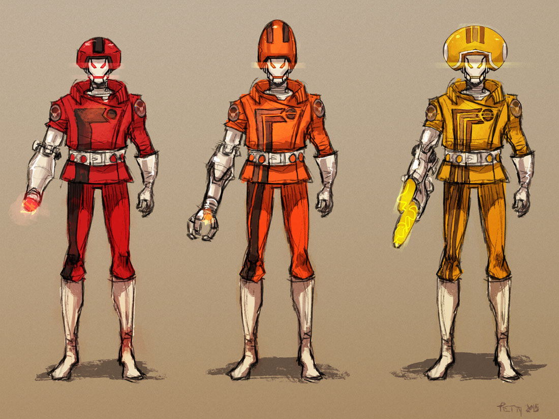
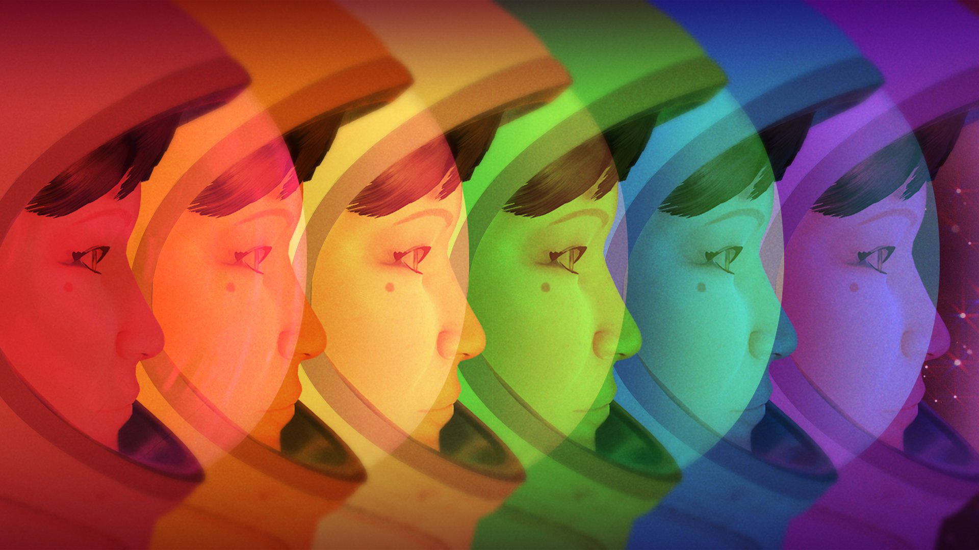
This early concept explored the enemy design for the game, whose power level increases in the order of the color spectrum (red, orange, yellow, green, blue, violet). Ultimately, we went with a less exaggerated style for the enemies (see image below).
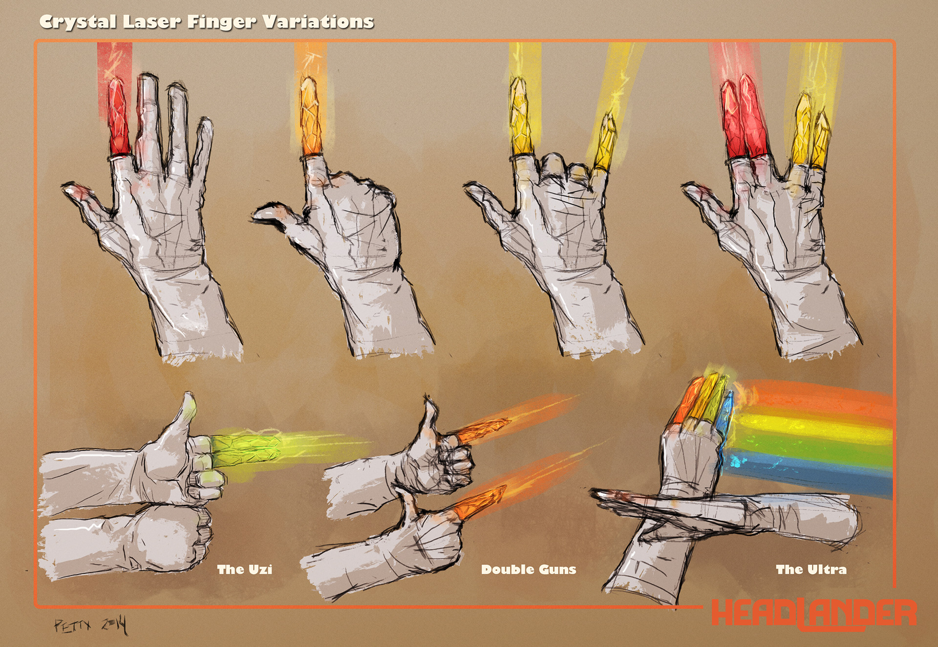
This concept explored the idea of the enemies using LASER FINGERS as their sole weapon, with different finger configurations forming different weapons. This idea was abandoned because the enemy size on screen made this impossible to see.

This image was created for a PS4 theme background, as part of a pre-order exclusive bonus.
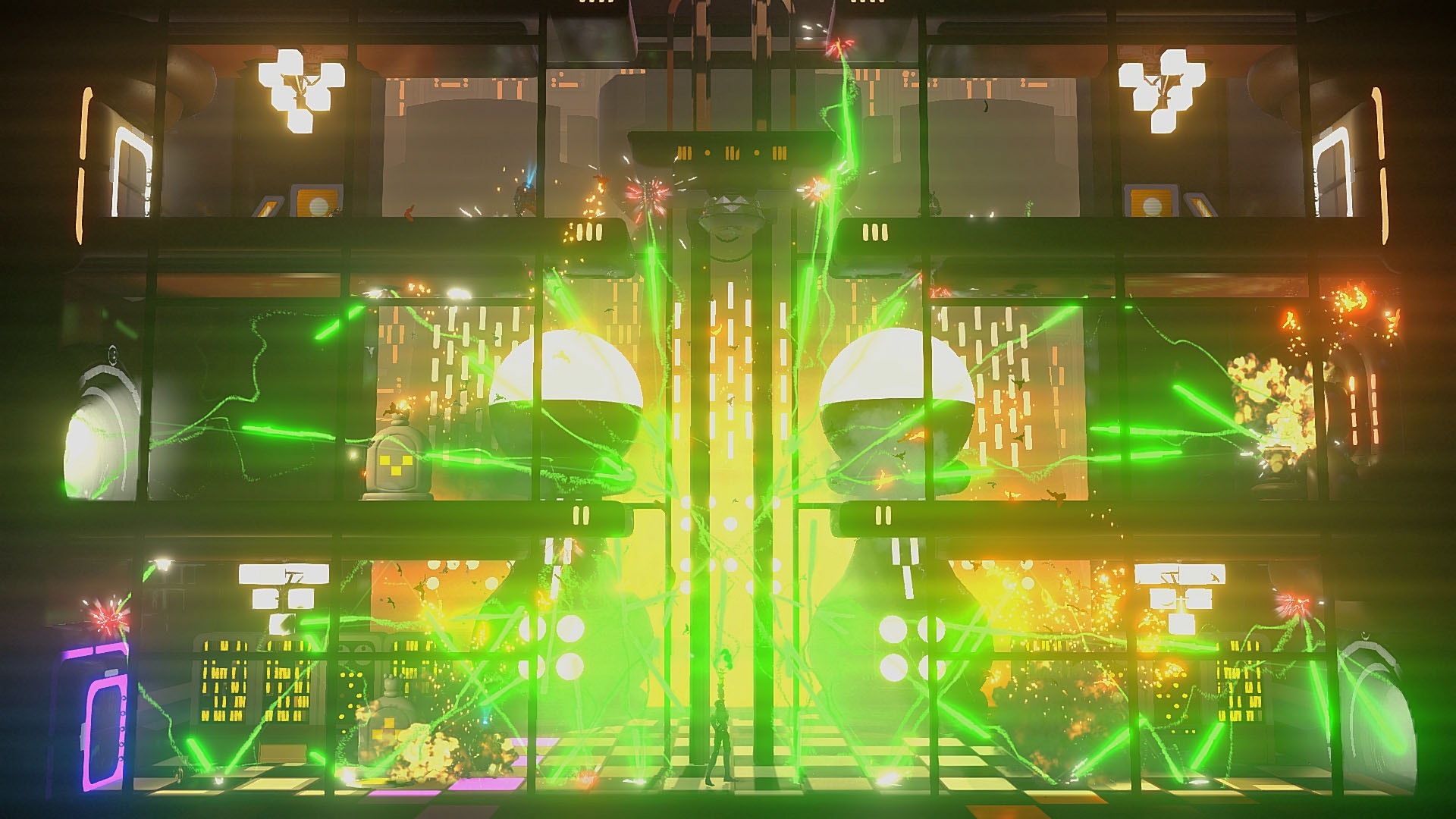
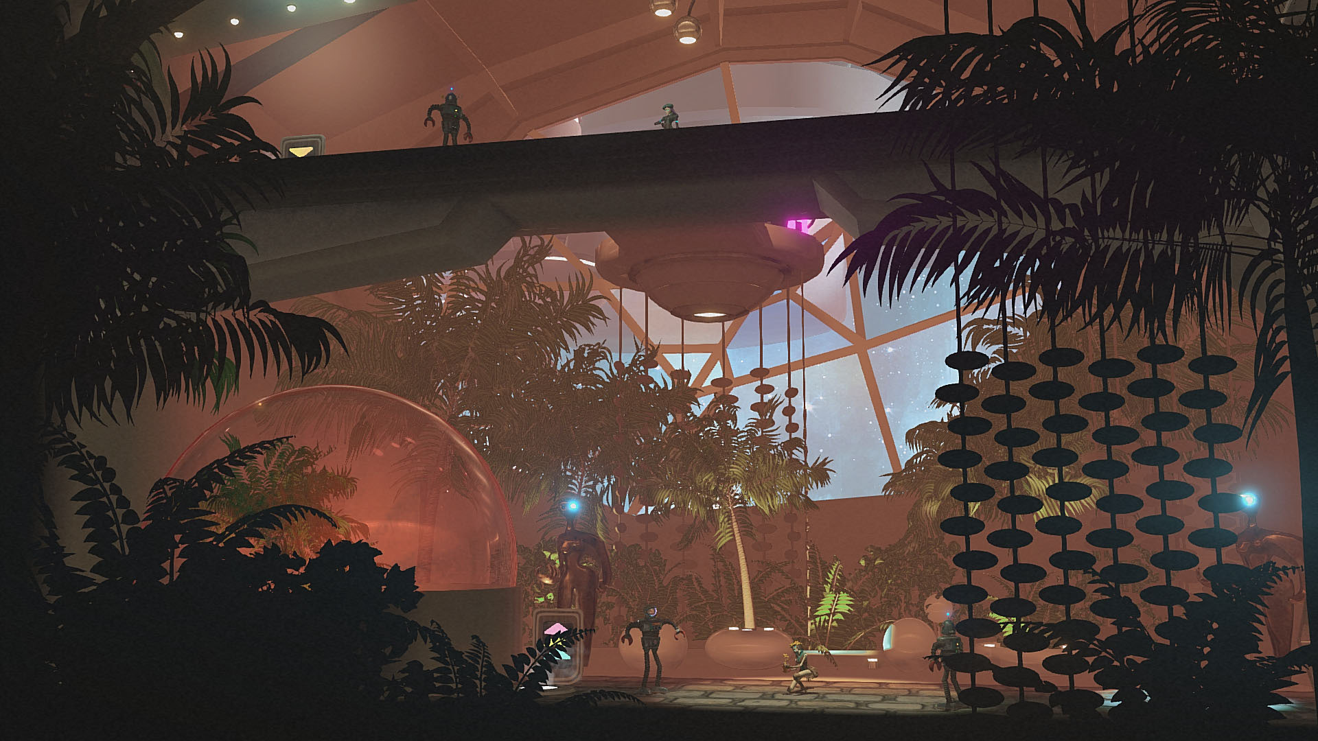
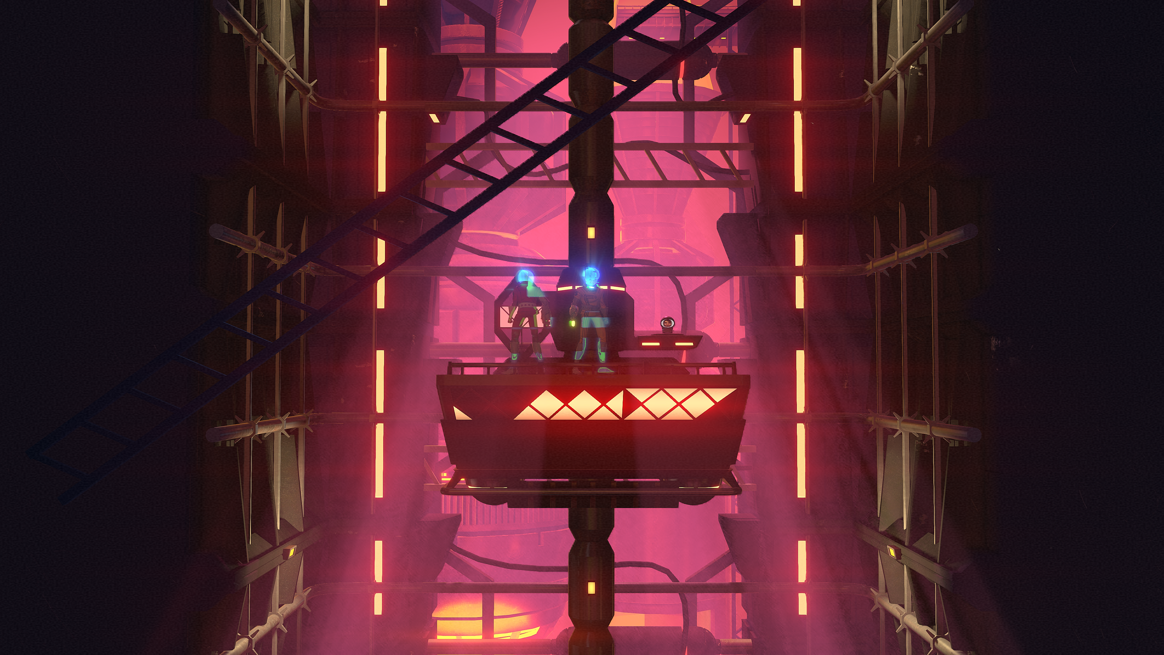
The following screenshots represent the work of the entire team.